The “blank slate” writing experience was a huge part of why I kept going back to Bear 1, with icons floating in the corners but otherwise out of the way. The aggressive divider line / drop shadow on the top bar feels like unnecessary intrusion of the UI and tools into the writing and menu space. I’d love for it to not be there or at least have an option to turn it off.
When you start writing the complete Toolbar of the editor automatically disappears. In editor-only mode and in fullscreen you have nothing else than just the text you are writing.
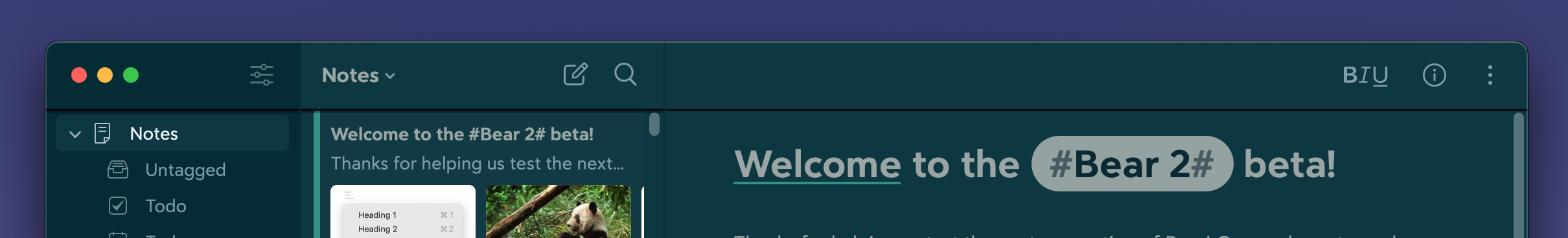
Furthermore the border of the toolbar in sidebar, editor and notes list has a function: it signals if there is content above what you see. It is not a visual gimmick
I don’t know—just realized this actually seems kind of buggy. The shadow only shows up when I switch themes, then permanently switches to a slightly transparent solid line instead of drop shadow when I scroll for the first time in both documents and menus. It stays that way even after quitting, but then reverts to the drop shadow when I change theme again. There’s also no padding between that divider line and the first list item, so I’m not sure which was supposed to be there and makes me wonder if it’s a bug.

Signaling scroll overflow isn’t really a problem for a writing app imo. Bear 1 doesn’t do this or require you to start typing to get its minimal UI, which is still my strong preference. Not even sure if this is relevant at this stage in the beta, just wanted to get the feedback logged.
Oh sorry, I misunderstood you
Yes, something is definitely buggy here. I think the problem manifests when the system “Show scroll bars” preference is set to “always”.
Thank you for reporting this problem.
1 Like